When you walk into a store, you don’t leave if you can’t see every aisle and what’s in each within 30 seconds. Unless you’ve mastered teleportation, you spent the time to drive there, park, and walk in. Going to another store will take longer than walking through the aisles to find what you need.
A website is a different beast. If you can’t figure out how to navigate it, pulling up a better alternative takes a minute or less.
Likewise, your site visitors won’t look past the homepage if they can’t find the main menu or navigate it.
Ecommerce websites average a 20% to 45% bounce rate, and if yours are on the higher end, it could be due to unintuitive navigation.
Many elements make up an effective navigation strategy, but your menu icon is step one for your visitors—and not all menu icons are created equal.
So, which one is on your website? And is it the one that should be?
First Things First: Menu Icons vs Nav Bars
Of course, menu icons aren’t the only option. A traditional navigation bar is generally the easiest way to present your website’s pages in the least amount of clicks.
But if you have several important pages, including all of them in a nav bar is clutter central. And on a smaller screen (hi, smartphones), the design gets cluttered much faster.
On an ecommerce website, menu icons:
- Contribute to minimalist web design.
- Hide distractions to help guide users to priority content.
- Can use drop-downs to provide direct access to more pages.
However, if you have only a few pages on your website or application, using a traditional nav bar for desktop will make users’ options more apparent.
You can also double up: we often suggest using a nav bar for your most important pages and a menu icon to the right or left for secondary pages if they’re needed.
Why the Right Menu Icon Matters
You know why a menu icon is useful, but why does which one matter?
Current and potential customers go to your website with some expectations in mind. And because we all have a history of interacting with the internet, those expectations include ideas of what different menu icons mean.
When they click on a hamburger icon, for example, they expect to receive access to your website’s most significant pages—which should include the page they’re looking for. (More on types of icons in a bit.)
Considerations for Effective Menu Icons
Your web designer considers many factors for every design choice they make. When we decide on a menu icon type and its style and location for clients, we consider:
- Device: The smartest menu display depends on screen size, balancing usability and aesthetic experience.
- Audience: Demographics like age and culture can influence optimal icon size, color contrast, and user paths.
- Accessibility: Accessible design benefits users with disabilities and often follows best practices for all users.
- Site complexity: Number of pages, site architecture, page priority, and the actions available to users all play a critical role in which menu icon(s) to use.
- Website goals: Site goals (conversions, awareness, engagement) translate to actions you want users to take. Smart menu choices encourage these actions and make them easier to accomplish.
- Brand: A website’s menu icon should match the rest of the website and brand.
- Design precedence (i.e., unspoken design rules): Some UI choices are everywhere because they’ve become a universal expectation. Sometimes, coloring inside the lines makes life easier for users.
When to Use Each Type of Menu Icon and Great Examples
On our first page, you’ll find our breakfast options and seasonal— Okay, not that kind of menu.
But the most common menu icons have food-inspired names (for obvious reasons). Here are some solid examples of when your site might use each one.
The Hamburger Icon
- What it is: three equal lines horizontally stacked
- Also called: collapsed menu icon
- Where it goes: the top left or right of the screen
- Uses: condense a list of page links, prevent clutter, and maximize digital space
Example 1: YETI
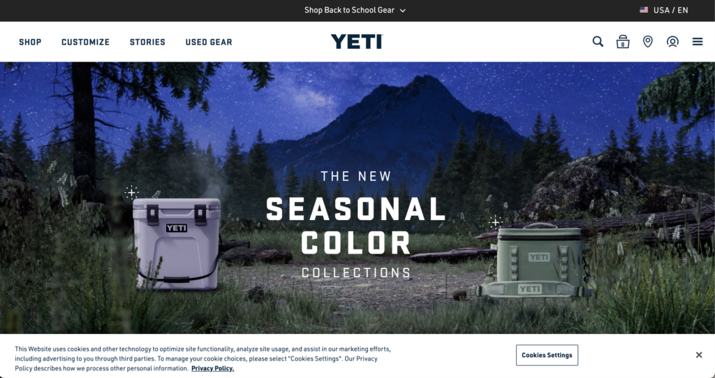
Yeti combines a hamburger icon with a traditional nav bar, favoring usability and simplicity.
The company places its CTAs on the left nav bar (“Shop,” “Customize”) and condenses customer support and company information in the hamburger icon—prioritizing the purchase CTAs.
In Yeti’s mobile view, to account for less space, it moves the CTAs within the hamburger icon, though prioritized towards the top.
Yeti also uses a set of traditional ecommerce icons, including a magnifying glass (search icon), a shopping bag (also commonly a cart), and a person (account management). Since Yeti has physical storefronts, they also have a pin/location icon for finding a local store.
Example 2: Burger King
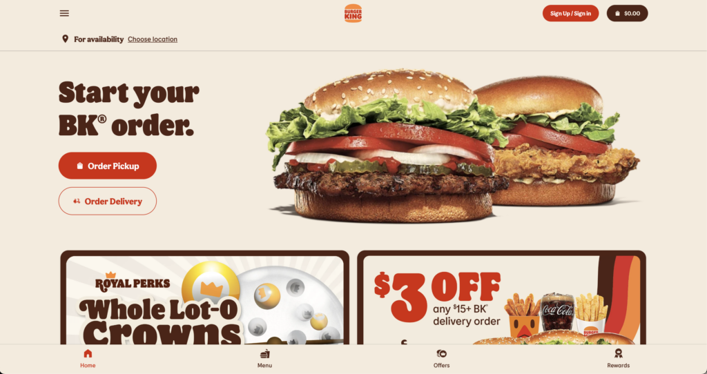
It doesn’t get much more intentional than Burger King using a hamburger icon for its website.
By hiding company information, customer support, locations, the rewards program, and legal information within the hamburger icon, Burger King focuses your attention on the CTAs “Order Pickup” and “Order Delivery.”
The Kebab Icon
- What it is: three equal dots vertically stacked
- Also called: three-dot menu, vertical three-dot icon, more options
- Where it goes: at the end of a set of tools or options or at the top right of the screen
- Uses: condense a list of secondary tools and options
Example 1: TikTok
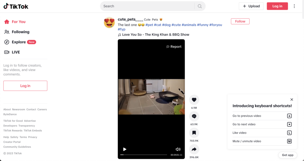
TikTok’s website places a heavy emphasis on its product (short-form videos) in the middle of the screen and user options to “Search,” “Upload,” and “Log in.”
The kebab menu icon in the top-right corner hides more secondary features (like language, feedback, and dark mode).
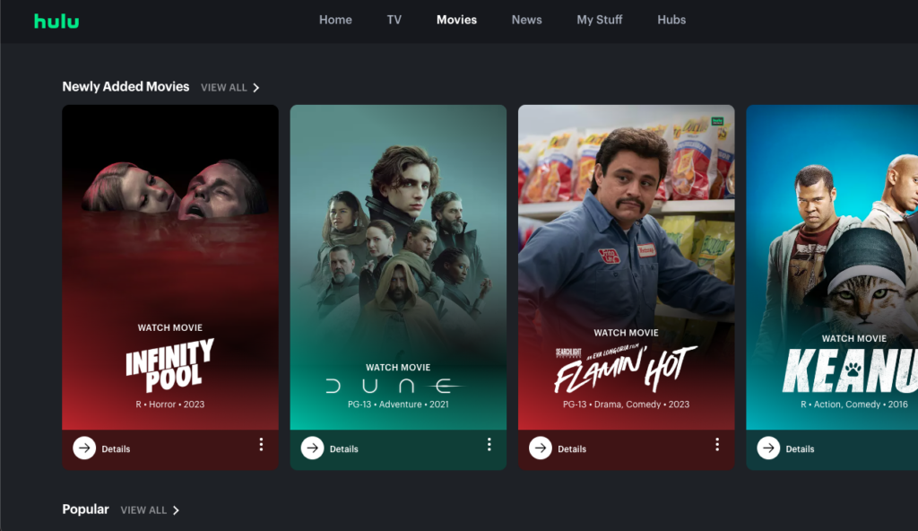
Example 2: Hulu
Hulu uses several kebabs to indicate action items for each movie, including the ability to like, dislike, and “add to my stuff.”
As Hulu’s entire product experience is its website, this makes sense visually. The more options it can hide, the less unnecessary clutter there is for the user to contend with while enjoying the product.
The Meatballs Icon
- What it is: three equal dots in a horizontal line
- Also called: more options, three horizontal dots icon, ellipsis menu icon
- Where it goes: next to an option or tool list, great for horizontal locations like a table
- Uses: condense a list of less important tools or options for a site element
Example: Twitter (X)
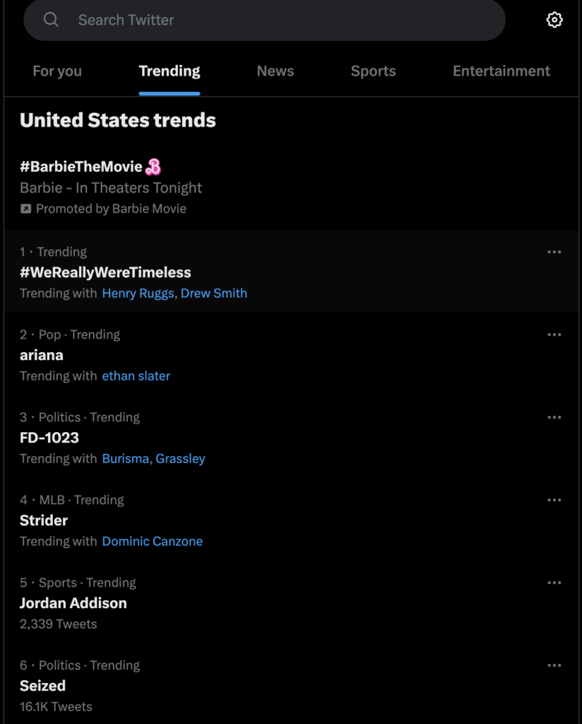
Like Hulu, Twitter (or X if you abide by Elon) uses an icon for each interactive item on the Explore page. The meatball menu icons reveal two feedback options for each trending topic: that the user is not interested in the trend or that it’s harmful.
The meatballs keep this trending topics page from getting cluttered with options the user doesn’t need right away or may not use.
The Bento Icon
- What it is: nine equal squares forming a box
- Also called: grid-based menu
- Where it goes: usually top right of the screen
- Uses: condense a menu of apps or solutions within a product
Example: LinkedIn
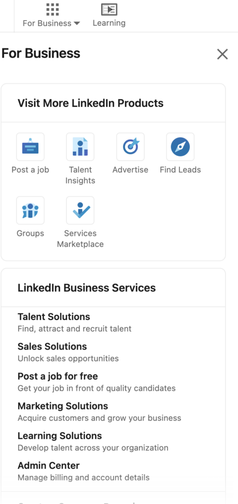
LinkedIn uses a bento icon in its top-right corner for other products it offers to businesses, including advertising and talent insights. LinkedIn’s screen is already full of information, buttons, and CTAs. The bento box justifiably condenses the website’s business section so it doesn’t interfere with users’ flow.
Example 2: Google Search
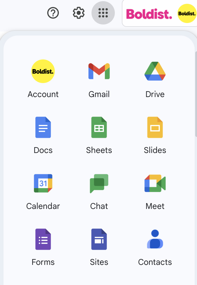
Google has long used a bento icon to hide the many tools and apps available to account users, from Google Drive and Calendar to Google Meets and Chat.
The Doner Icon
- What it is: three horizontal lines stacked vertically in descending order of size to form a funnel shape
- Also called: filter icon
- Where it goes: next to a list of sortable items or in a search bar
- Uses: condense filter options
Example: Google Sheets
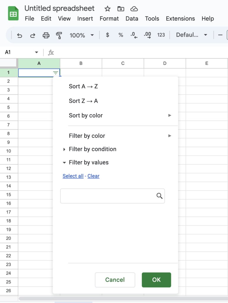
Google Sheets allows you to organize a set of cells using several filter and sort options. A doner menu icon appears when you select a cell and select “add a filter.” Clicking the icon reveals your filtering options.
On a spreadsheet platform that could easily become overwhelming with icons, buttons, and symbols, this icon adds predictable functionality.
The Cog Icon
- What it is: an open circle with blunted spikes around the circumference
- Also called: gear icon, settings icon
- Where it goes: top left or right of the screen or hidden within another menu icon
- Uses: condense settings
Example 1: Instagram
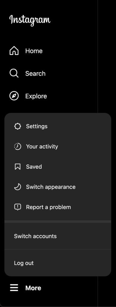
Instagram explicitly labels its cog icon as “Settings.” Labels help users familiarize themselves with potentially unfamiliar icons—although the cog icon is arguably a very common symbol. Over time, companies have the option of progressive reduction, in which you can remove labels from icons once users become used to them.
Example 2: Google’s Search Results Page
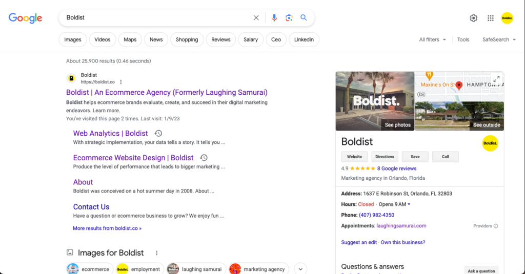
Alternatively, Google’s search results page has a gear icon in the top right corner without an explicit label. However, a “Quick Settings” label does appear when a user hovers over the symbol. This helps the user understand that these settings are distinct from other main settings and provides a convenient option for commonly adjusted settings.
Which Menu Icon Should My Ecommerce Website Use?
Ultimately, the menu icon your site should use is the one that the average user expects:
- For main menus, use the hamburger icon (if you don’t have the space to fit all of your critical routes in a nav bar).
- For secondary actions, use the kebab or meatball icons. (We don’t recommend using these for a main menu—no matter how much you like meat skewers).
- For a large offering of apps, use the bento box icon.
- For filtering, use a doner icon.
- For settings options, use the cog (aka gear) icon.
And be wary about being creative.
We know. It sounds dream-crushing, like a first-grade teacher discouraging imagination.
But when it comes to functional menu icons, it’s crucial to stand by the universally known meaning. Online consumers want to find what they’re looking for quickly, not decipher an icon they’ve never seen before or get a result they don’t expect.
What If My Site Menu Uses a Hover Effect?
We’ve seen some websites use hover effects, where hovering over a nav bar option or icon results in an automatic drop down of subpages. If your site uses this tactic, your designer likely thought it would aid the discoverability of those pages.
In truth, hover-and-expand menus are problematic because:
- They are inaccessible for people who use screen readers or have fine motor impairments.
- They annoy users who weren’t intending to open that menu.
- Users trying to use the menu often accidentally deactivate the menu when trying to scroll to a sub-menu item.
If you need to provide a menu drop-down, it’s better to require a click action than a hover action.
What’s on the Menu: An Informed Strategy Is Iconic
If you think a different menu icon could increase conversions or improve usability, A/B test the change. Maybe you were sure your audience would prefer a meatballs icon, but they’re actually hungry for a kebab.
And if your site analytics indicate a navigation problem and your menu icon isn’t the problem, you’ll want to evaluate other aspects of your site architecture, including your header and footer menus, the pages they link to, and the order and titles of those pages.